Shannon Soper
Gatsby Documentation Sidebar
Many React developers (or those interested in learning React) test out Gatsby by building portfolios, blogs, marketing sites, and e-commerce sites. Through dozens of interviews, I discovered that many users struggled to find the right documentation for common tasks, like adding a manifest file. There were many reasons for this:
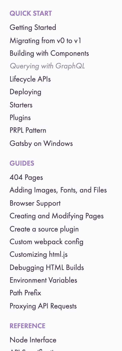
- menu items had inconsistent naming conventions, so users didn’t know what to search for with ctrl+f
- menu was long enough to extend below the fold, so some items weren’t visible
- there was no site search
- some common tasks were missing from the docs and only existed in the tutorial or plugin READMEs
Here’s a screenshot of what the sidebar looked like in late 2017
Design solutions
First, I setup card sorting and usability tests to learn what categories and naming schemes would match the user’s language. I decided to use nouns for categories and -ing verbs for docs since most tasks are action-oriented (e.g. adding links) and wrote the Gatsby Style Guide.
Running Hacktoberfest
Second, I ran a Hacktoberfest docs contribution project to merge over 30 docs contributions.
Accordion vs. flat menu?
Here’s a quick dive into a perplexing part of this project. We wanted a design that was:
- visually pleasing
- searchable
Yet it seemed hard to accomplish both at the same time, because accordion menus make design visually pleasing, yet flat menus make items searchable by keyboard navigation (ctrl+f).
I decided to compromise with the following plan:
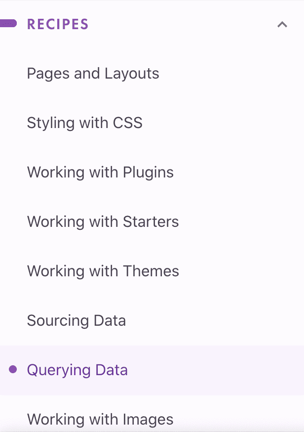
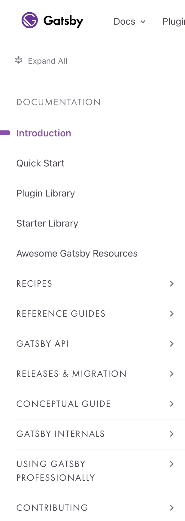
- default to a collapsed accordion
- include an expand all button
- save the state of the accordion menu for returning visitors
This isn’t a perfect design. In usability testing, I noticed that some people missed the “expand all” button so we tweaked the design until it was easier to see. Also, saving the state of the menu for each user is in the backlog.
Original post at the Gatsby Blog


